


01-01-2019, 06:55 PM
(This post was last modified: 01-01-2019, 06:58 PM by Mariofan230.)
Here are some custom made SMMDX mockups!
(credit to Awesomezack, FanofSMBX, Jacob-Turbo, Dariuscox357, Kirbypoyo567, Qwertyuiopasd1234567, Emman, Redbird030, Tinitroman and noobguy519)


[attachment=215]
[attachment=216]
(credit to Awesomezack, FanofSMBX, Jacob-Turbo, Dariuscox357, Kirbypoyo567, Qwertyuiopasd1234567, Emman, Redbird030, Tinitroman and noobguy519)
[attachment=215]
[attachment=216]
![[-]](https://forums.mfgg.net/images/emerald/collapse.png)


![[+]](/images/collapse_collapsed.png "[+]") Spoiler
Spoiler Also i made a few more mockups that aren't SMB1 as you can see:
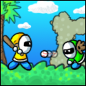

 , Unless you misspelled it and you were trying to say three? Some SMM sprites in the original game do have four colors or more just so you know
  .
.